Setting up an Environment
To see the process of creating a Dashboard widget, follow these steps to set up the development environment project. The result is a new widget that shows a clear view of a Thng property’s latest value. This is similar to how a built-in widget shows only one value when there is only one series available. The Thng and property to be displayed are selected through the widget’s configuration.
Prepare the Project
To begin, clone the dashboard-components-starter repository to a local directory of your choosing.
Next, run npm install to install the dependencies. You can then run the build command without error:
# Use local gulp
./node_modules/.bin/gulp build
Add a New Component
Create a widget with the component task with the name property-view:
# Create a new component called 'property-view'
./node_modules/.bin/gulp component --name property-view
This sets up a basic file along the lines of the ones examined in the preview section in src/components/property-view. Look at these in more detail to familiarize yourself with them in this context.
First, the widget controller class:
import './property-view.scss';

export class PropertyViewController {

  constructor() {
    this.name = 'property-view';
  }

}

export default {
  bindings: {},
  template: `
    <div>
      <h1>{{ $ctrl.name }}</h1>
    </div>
  `,
  controller: PropertyViewController
};
Next, the CSS styles:
property-view {
  color: red;
}
Last, the test specs (if you want to use them):
import {PropertyViewController} from './property-view';

describe('property-view component', () => {
  let ctrl;

  beforeEach(() => {
    ctrl = new PropertyViewController();
  });

  it('should have initial state', () => {
    expect(ctrl.name).to.equal('property-view');
  });

  // ...
});
To ensure that the new component is included in the built bundle, add it to src/components/components.js. (The example below has also removed the other example components for brevity):
NoteBe sure to set a new name for the Angular module from the default (
myModule.components) in case it conflicts with any other custom widget modules that used it previously.
import propertyView from './property-view/property-view';

export default angular.module('propertyView.components', [])
  .component('propertyView', propertyView);
Deployment
Before going further, build and test this widget. First, build the bundle, which is output to the dist directory. This is the file that you provide to the Dashboard:
# Buile the bundle
./node_modules/.bin/gulp build
To use the bundle (and the widget contained within) in the Dashboard, the bundle must first be hosted on a publicly accessible URL. For example, using the Files API through the EVRYTHNG CLI:
# Create file resource
evrythng files create '{
  "name": "components.bundle.js",
  "type": "application/js",
  "privateAccess": false
}'

# Upload using the ID provided by the ‘create’ command
cd ./dist
evrythng files :id upload ./components.bundle.js application/js
or alternatively a public Dropbox link (with dl instead of www), such as the following:
https://dl.dropboxusercontent.com/s/q865yua9n1syehl/components.bundle.jsor another solution of your choice that provides a URL to the raw file contents.
After you have your public link to the bundle, go to a Dashboard page of your choosing and click the ‘Edit dashboard’ button at the top. Expand ‘Advanced settings’ and add the bundle using the URL.

Then, go to any section (or create one) and add the widget using its component name, here property-view:

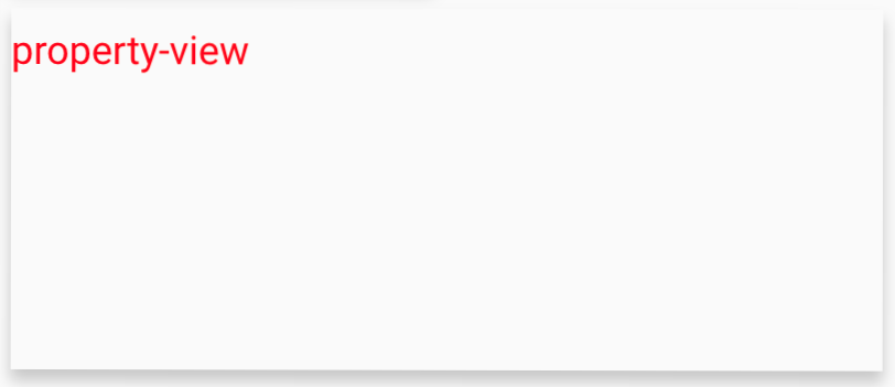
Finally, click Update. The Dashboard reloads and contains the new widget. It's basic at the moment, but you'll add functionality in the upcoming steps.

Congratulations! You can now continue building your first custom widget as detailed in the next section.
Updated 12 months ago
