Anatomy of a Widget
Each new Dashboard widget has a few different files that are set up for you when using the starter project we provide. Assuming the component name is evrythng-widget:
evrythng-widget.html- the structure of the widget’s elements.evrythng-widget.scss- CSS (or SCSS) controlling how those elements look.evrythng-widget.js- the logic controller behind the scenes, managing data flow in and out.
Let’s look at some examples of these files first, before creating a widget in the next section.
HTML
The Angular template is defined in HTML and describes the structure of the elements the widget contains. To benefit from built-in styles, the widget must use the provided evtx-widget-base component:
<evtx-widget-base evt-widget="$ctrl.evtWidget" loading="false">
  <widget-body layout="column">
    <div class="wrapper">
      <img class="image" src="https://evrythng.com/wp-content/uploads/EVRYTHNG-logo.png"/>
      <div class="description">
        Here's an example widget containing the EVRYTHNG Logo.
      </div>
    </div>
  </widget-body>
  <widget-footer layout="row" class="truncate">
    <span flex>This is the footer text</span>
  </widget-footer>
</evtx-widget-base>
The base widget uses the widget-body and widget-footer components provided by the Dashboard to allow it to use the existing look and feel of the Dashboard itself. It can also use the built-in title and description elements and take advantage of the support for user-configurable options (including the title and description configurable on most other widgets).
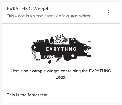
After some styling, this example looks like the following when imported into the Dashboard and given a 1x1 space on the grid:

CSS
The evrythng-widget.scss file contains the CSS (and optionally SCSS) parameters that determine how the elements defined in the HTML file are styled visually. For the example widget, this looks like the following:
.wrapper {
  display: flex;
  flex-direction: column;
  width: 100%;
  height: 100%;
  align-items: center;
  justify-content: center;
}

.image {
  width: 200px;
  height: auto;
  margin-top: 10px;
  margin-bottom: 10px;
}

.description {
  font-size: 1.4rem;
  text-align: center;
}
A wrapper class aligns the image and descriptive text, as well as a class for each that controls their size and individual alignment. Notice the styling of the base widget (as well as its title, description, and footer) is automatically handled for you because the widget extends the evtx-widget-base component.
JavaScript
The JavaScript file contains the widget’s controller class, as well as Angular-specific configuration (including bindings and EVRYTHNG-specific configuration). This is where all the widget specific logic is placed, such as loading data from the account or other sources, and processing it for display in the widget’s elements. For the example widget, this looks as follows:
import './evrythng-widget.scss';

import template from './evrythng-widget.html';

export class EvrythngWidgetController {

  constructor($scope) {
    'ngInject';

    this.$scope = $scope;
  }

}

export default {
  bindings: { evtWidget: '<' },
  evtWidget: {
    defaultConfig: {
      title: { value: 'EVRYTHNG Widget' },
      description: { value: 'This widget is a simple example of a custom widget.' },
    }
  },
  template,
  controller: EvrythngWidgetController,
};
Some key features to note:
$scope- is a reference to the widget controller instance and is used to manipulate it at runtime.template- is imported as HTML and passed to the Angular binding in the module’s exports.evtWidget- tells the Dashboard that this widget is a compatible widget, otherwise it's not imported.defaultConfig- includes a description of all the values a user can configure and their default values. These are shown under the Configure item in the widget’s three-dot menu.
In the next section, you'll build a simple widget that shows data from the user’s account.
Updated 12 months ago
