Create an Interactive Widget
This last section of the walkthrough covers how to create a widget that's more than just a data view. When you test an EVRYTHNG Platform integration, a common task is to create an action (useful for testing a Reactor script, Redirector rule, populating a Thng’s history, and so on). You create this action through the Testing section of the Dashboard. Actions can also be useful tools to have elsewhere in the application. This walkthrough shows example functionality.
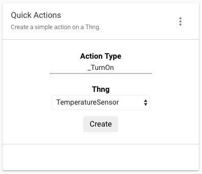
The final product will look like the following:

NoteComplete Create a Simple Widget before starting this walkthrough.
Initial Setup
Use the component gulp task to create files for this widget (called quick-actions), or adapt the one from Create a Simple Widget. The three files begin as shown below:
<evtx-widget-base evt-widget="$ctrl.evtWidget" loading="false">

  <widget-body layout="column">
    <div class="action-wrapper">

    </div>
  </widget-body>

  <widget-footer layout="row" class="truncate">

  </widget-footer>

</evtx-widget-base>
.action-wrapper {
display: flex;
flex-direction: column;
justify-content: center;
align-items: center;
height: 100%;
}import './quick-actions.scss';
import template from './quick-actions.html';
export class QuickActionsController {
constructor($scope, EVT) {
'ngInject';
this.$scope = $scope;
this.EVT = EVT;
}
$onInit() {
this.refresh();
}
refresh() {
}
createAction() {
}
}
export default {
bindings: { evtWidget: '<' },
template,
evtWidget: {
defaultConfig: {
title: { value: 'Quick Actions' },
description: { value: 'Create a simple action on a Thng.' },
}
},
controller: QuickActionsController,
};As you can see, the HTML template begins like the widget from the last section. It has an initial div wrapper class that controls the alignment of the elements that you'll add shortly. The JavaScript controller also has a similar structure including the defaultConfig from the beginning, as well as some other empty methods that will be fully implemented later.
Add the Inputs
As seen at the top of this page, the widget itself has a few interactive elements:
- A text
inputto allow the user to specify the action type to use for the created action. - A
selectallowing a choice of the 30 most recently created Thngs on which the action will be created. - A
divthat will behave like a button and run thecreateAction()on the controller, performing the actual resource creation.
NoteReplace the
selectwith a type-ahead search for a real use case.
There are also two div elements to label each input element. Add all these to your quick-actions.html (or equivalent) file using the example below. The CSS class definitions are also shown. Copy them to quick-actions.scss:
<widget-body layout="column">
  <div class="action-wrapper">
    <div class="action-label">Action Type</div>
    <input class="action-input" type="text" ng-model="$ctrl.state.actionType"/>

    <div class="action-label">Thng</div>
    <select class="action-select" ng-model="$ctrl.state.selectedThng">

    </select>

    <div class="action-button" ng-click="$ctrl.createAction()">Create</div>
  </div>
</widget-body>
.action-label {
font-size: 1.5rem;
color: black;
font-weight: bold;
}
.action-input {
width: 200px;
outline: 0;
border: none;
text-align: center;
border-bottom: 2px solid #bbb;
margin-bottom: 20px;
}
.action-input:hover {
border-bottom: 2px solid #888;
}
.action-input:focus {
border-bottom: 2px solid black;
}
.action-select {
height: 30px;
background-color: white;
border: 1px solid #eee;
margin-bottom: 5px;
}
.action-button {
padding-top: 5px;
padding-bottom: 5px;
padding-left: 12px;
padding-right: 12px;
margin-top: 5px;
background-color: white;
color: black;
font-size: 1.5rem;
border: 2px solid white;
border-radius: 5px;
}
.action-button:hover {
background-color: #eee;
cursor: pointer;
}
.action-button:focus {
outline: none;
}Note the use of Angular bindings to connect the ng-click event on the button to the createAction() method from the controller class. There are also model bindings (using ng-model) of the action type input and Thng select to the controller classes state property, which doesn't yet exist. Fix that by adding the state in the controller’s constructor in quick-actions.js:
constructor($scope, EVT) {
'ngInject';
this.$scope = $scope;
this.EVT = EVT;
this.state = {
actionType: 'scans',
thngs: [],
selectedThng: '',
footerText: '',
};
}This state lets the widget track the user’s chosen action type and Thng, as well as the Thngs downloaded. It includes the footerText property that you'll use later to show the state of the action creation process. The ng-model binding in the HTML template updates these attributes automatically as the user types or selects an item from the Thng select.
The Thngs that are available to choose from are read from the account when the widget loads, using the refresh() method, which is currently empty. The completed version of this method is shown below. Add it to your quick-actions.js:
refresh() {
this.EVT.operator.thng().read()
.then((thngs) => {
this.state.thngs = thngs;
this.state.selectedThng = thngs[0].id;
})
.catch((err) => {
console.log(err);
alert(err);
})
.then(() => this.$scope.$apply());
}This method ensures that the state receives the list of read Thngs, with the first one chosen as the currently selected Thng. The Angular ng-model bindings update the widget template after $apply() is called.
Now that the list of Thngs to choose from is available in code, present it to the user by adding an option element inside the select for each item in the list. Angular makes this possible by using the ng-repeat directive. Update the select in the HTML template as follows:
<select class="action-select" ng-model="$ctrl.state.selectedThng">
<option ng-repeat="item in $ctrl.state.thngs" value="{{ item.id }}">
{{ item.name }}
</option>
</select>The select element shows and updates the selectedThng property of the widget’s state. It contains an option for each item in state.thngs, where the Thng’s ID is the option's value and the Thng’s name is its visible text. This is possible through the ng-model bindings and template values.
Create the Action
The next piece of missing functionality is the creation of the action when the button is clicked or tapped. Because the ng-click directive is already in place on the button in the HTML template, all that remains is to implement the method it refers to (createAction()) in the JavaScript controller:
createAction() {
// Create payload from state
const { selectedThng, actionType } = this.state;
const payload = { type: actionType, thng: selectedThng };
// Create action and update template
this.EVT.operator.thng(selectedThng).action(actionType).create(payload)
.then((action) => {
this.state.footerText = `Action created successfully!`;
})
.catch((err) => {
console.log(err);
alert(err);
})
.then(() => this.$scope.$apply());
}The method uses the values of the selectedThng and actionType from the widget state (as bound to the HTML elements earlier) to create a payload for the Create an Action API operation. Then, the operator scope, made available by the Dashboard, performs the action creation using the evrythng.js SDK, also provided by the Dashboard.
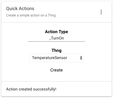
If the operation is successful, the value of footerText is updated and applied. This shows the user that their action was created. If it fails, the error is shown as an alert and written to the console for debugging.
Add this final element (widget-footer) to the HTML template now, below widget-body. Note that it uses the same template value mechanism to show the value present in the widget - state.footerText:
<widget-footer layout="row" class="truncate">
<span flex>{{ $ctrl.state.footerText }}</span>
</widget-footer>Use the Widget
As in [Create a Simple Widget],(ref:actions#create-an-action) the widget needs to be added to src/components/components.js to be included in the built bundle:
import propertyView from './property-view/property-view';
import quickActions from './quick-actions/quick-actions';
export default angular.module('propertyView.components', [])
.component('propertyView', propertyView)
.component('quickActions', quickActions);Use the gulp task to assemble the component bundle and add it to your hosting service of choice:
# Build the bundle
./node_modules/.bin/gulp build
NoteIf the public URL of the bundle has changed, update the list of bundles in the dashboard section’s Edit dashboard dialog as before.
Add this new widget to your dashboard section of choice by opening the ‘Edit dashboard’ dialog, choosing a section, and adding the quick-actions widget. Save the configuration and let the page reload. The new widget is shown and ready for use.

To test the widget, enter an existing action type, select a Thng, click the Create button, and verify the result message appears in the footer. If the action creation fails, be sure the None project scope is selected on the left and that the action type exists. If it doesn't, create it with the Action Types page.

To see the action that was created, navigate to the Actions page and read the top line of the list:

Conclusion
This is the end of the walkthrough. We hope you've gained insight into how EVRYTHNG Dashboard widgets work and how they're are constructed. You're ready to start experimenting.
Below are the final versions of all of the Quick Actions files for you to compare with your own and help identify any mistakes.
<evtx-widget-base evt-widget="$ctrl.evtWidget" loading="false">
<widget-body layout="column">
<div class="action-wrapper">
<div class="action-label">Action Type</div>
<input class="action-input" type="text" ng-model="$ctrl.state.actionType"/>
<div class="action-label">Thng</div>
<select class="action-select" ng-model="$ctrl.state.selectedThng">
<option ng-repeat="item in $ctrl.state.thngs" value="{{ item.id }}">
{{ item.name }}
</option>
</select>
<div class="action-button" ng-click="$ctrl.createAction()">Create</div>
</div>
</widget-body>
<widget-footer layout="row" class="truncate">
<span flex>{{ $ctrl.state.footerText }}</span>
</widget-footer>
</evtx-widget-base>.action-wrapper {
display: flex;
flex-direction: column;
justify-content: center;
align-items: center;
height: 100%;
}
.action-label {
  font-size: 1.5rem;
  color: black;
  font-weight: bold;
}

.action-input {
  width: 200px;
  outline: 0;
  border: none;
  text-align: center;
  border-bottom: 2px solid #bbb;
  margin-bottom: 20px;
}

.action-input:hover {
  border-bottom: 2px solid #888;
}

.action-input:focus {
  border-bottom: 2px solid black;
}

.action-select {
  height: 30px;
  background-color: white;
  border: 1px solid #eee;
  margin-bottom: 5px;
}

.action-button {
  padding-top: 5px;
  padding-bottom: 5px;
  padding-left: 12px;
  padding-right: 12px;
  margin-top: 5px;
  background-color: white;
  color: black;
  font-size: 1.5rem;
  border: 2px solid white;
  border-radius: 5px;
}

.action-button:hover {
  background-color: #eee;
  cursor: pointer;
}

.action-button:focus {
  outline: none;
}import './quick-actions.scss';
import template from './quick-actions.html';
export class QuickActionsController {
constructor($scope, EVT) {
  'ngInject';

  this.$scope = $scope;
  this.EVT = EVT;

  this.state = {
    actionType: 'scans',
    thngs: [],
    selectedThng: '',
    footerText: '',
  };
}
$onInit() {
this.refresh();
}
refresh() {
  this.EVT.operator.thng().read()
    .then((thngs) => {
      this.state.thngs = thngs;
      this.state.selectedThng = thngs[0].id;
    })
    .catch((err) => {
      console.log(err);
      alert(err);
    })
    .then(() => this.$scope.$apply());
}
createAction() {
  // Create payload from state
  const { selectedThng, actionType } = this.state;
  const payload = { type: actionType, thng: selectedThng };

  // Create action and update template
  this.EVT.operator.thng(selectedThng).action(actionType).create(payload)
    .then((action) => {
      this.state.footerText = `Action created successfully!`;
    })
    .catch((err) => {
      console.log(err);
      alert(err);
    })
    .then(() => this.$scope.$apply());
}
}
export default {
bindings: { evtWidget: '<' },
template,
evtWidget: {
defaultConfig: {
title: { value: 'Quick Actions' },
description: { value: 'Create a simple action on a Thng.' },
}
},
controller: QuickActionsController,
};Updated 12 months ago
