Create a Simple Widget
In this section, you'll complete the simple widget you began in the last section—a clear view into a single Thng property’s current value, useful for a summary of important properties.
NoteBe sure you've completed the previous section before continuing.
Prepare the Template
The src/components/property-view/property-view.js file contains the HTML structure of the widget included inside the module’s export. Because it grows larger and more complex, move it to its own file in the same directory, property-view.html, and include it in the JavaScript file using import. Then, update the export to refer to the imported template in the template field, as the following two samples show:
<div>
  <h1>{{ $ctrl.name }}</h1>
</div>
import './property-view.scss';
import template from './property-view.html';
export class PropertyViewController {
constructor() {
this.name = 'property-view';
}
}
export default {
bindings: {},
template,
controller: PropertyViewController
};To extend the basic Dashboard widget component’s styles and automatically include some basic layout features, replace the contents of property-view.html with the following:
<evtx-widget-base evt-widget="$ctrl.evtWidget" loading="false">

  <widget-body layout="column">

  </widget-body>

  <widget-footer layout="row" class="truncate">

  </widget-footer>

</evtx-widget-base>
The outermost element, evtx-widget-base, has attributes that enable binding to the evtWidget property available at runtime (more on this later) and a state that shows whether it's loading data or has finished loading data.
Within this element are two more, whose names describe their purposes: widget-body and widget-footer. These two child elements contain the remaining elements in the body of the widget or the footer area.
Prepare the JavaScript
Edit the property-view.js file and update the export as follows to include evtWidget in bindings, as well as the defaultConfig object describing configurable values of evtx-widget-base. Later, you'll add more items to this object to allow the user to select the Thng and property they'd like to show:
export default {
  bindings: { evtWidget: '<' },
  template,
  evtWidget: {
    defaultConfig: {
      title: { value: 'Property View' },
      description: { value: 'This widget shows the state of a Thng property.' },
    }
  },
  controller: PropertyViewController,
};
These changes let you bind evtWidget to the HTML (also required for the evtx-widget-base component to show the title and description from the defaultConfig). They also provide a place to specify default values for that user configuration.
Last, update the PropertyViewController class definition as follows:
export class PropertyViewController {

  constructor($scope) {
    'ngInject';

    this.$scope = $scope;
  }

}
This tells Angular to provide you with a reference to the class instance that can be used in other methods, which you'll use later on.
To test out this new version of the widget, repeat the build step:
# Build the bundle
./node_modules/.bin/gulp build
Then, repeat the steps to update the public URL using the storage mechanism or service of your choice. The URL can stay the same, but if this isn't possible, be sure you remove and re-add the bundle in the dashboard page’s Edit Dashboard modal.
Click Update to save the changes to the dashboard section. Wait for the Dashboard to reload. Because you added the configuration capability to a widget already in the dashboard section, you might need to remove it and re-add it before the title and description become visible.
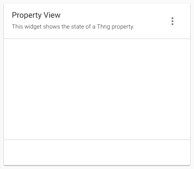
After this, you can see that the widget not only looks like the built-in widgets, but it also has the defaultConfig values you specified earlier displayed in the base widget:
Enhance the Widget
Next, change the template HTML file to contain three elements which display the property name, property value, and Thng ID. This change gives the widget its ability to serve as a quick glance view of that property's value. Update the property-view.html file as shown below, with the new elements added in widget-body and widget-footer:
<evtx-widget-base evt-widget="$ctrl.evtWidget" loading="false">

  <widget-body layout="column">
    <div class="wrapper">
      <div class="property-name">temperature</div>
      <div class="property-value">23.235</div>
    </div>
  </widget-body>

  <widget-footer layout="row" class="truncate">
    <div class="thng-details">Thng: UK4sACmwqGax92aaa2rm8kar</div>
  </widget-footer>

</evtx-widget-base>
Note the following changes:
- The
wrapperclassdivthat controls the overall alignment of its children. - The
property-nameclassdivthat contains the property name. - The
property-valueclassdivthat contains the property value. - The
thng-detailsclassdivin the footer, that shows the Thng ID.
The values of these classes are hardcoded for now, so you can verify the styles are correct. Later in this section, they're replaced with dynamic placeholders to be populated by the JavaScript controller.
To ensure the classes used above are defined, update the property-view.scss file with the following:
.wrapper {
  display: flex;
  flex-direction: column;
  align-items: center;
  justify-content: center;
  height: 100%;
}

.property-name {
  font-size: 4rem;
  margin-bottom: 10px;
}

.property-value {
  font-size: 8rem;
  font-weight: bold;
}

.thng-details {
  color: grey;
}
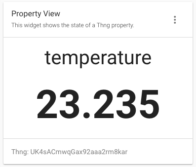
Perform the build and upload steps again, but this time you won’t have to remove or re-add anything. The Dashboard gets the changes with a simple reload. Now you can see the new layout and styles and see what the widget can do:
Show Real Data
The final steps necessary for this widget to show real, useful data are as follows:
- Modify the configuration to let the user specify the Thng ID and property name.
- Fetch that data using the built-in EVRYTHNG SDK.
- Display the values within the widget’s template.
This is accomplished by making changes in property-view.js. First, update the module’s export to include two new configuration values you'll use to select which Thng property the widget displays, and to give placeholder values for each:
export default {
  bindings: { evtWidget: '<' },
  template,
  evtWidget: {
    defaultConfig: {
      title: { value: 'Property View' },
      description: { value: 'This widget shows the state of a Thng property.' },
      thngId: { value: 'THNG_ID' },
      propertyName: { value: 'PROPERTY_NAME' },
    }
  },
  controller: PropertyViewController,
};
Next, update the controller class to inject a reference to the EVT SDK instance provided by the application, and set an initial state to reflect values in the template:
export class PropertyViewController {

  constructor($scope, EVT) {
    'ngInject';

    this.$scope = $scope;
    this.EVT = EVT;
    this.state = {
      propertyName: '',
      propertyValue: '',
      thngId: '',
    };
  }

}
Add the following method to the class that's to be called when the widget is the initially loaded:
$onInit() {
  this.refresh();
}
Be sure this method is called by adding the on-config-change attribute to the evtx-base-widget tag in the HTML file. This way, the widget's updated when the Thng ID or property name specified by the user is changed:
<evtx-widget-base evt-widget="$ctrl.evtWidget" loading="false"
  on-config-change="$ctrl.refresh()">
Implement the previously mentioned refresh() method in the class to load the data:
refresh() {
  const { thngId, propertyName } = this.evtWidget.config;

  // Reset state
  this.state.propertyName = propertyName.value;
  this.state.propertyValue = '';
  this.state.thngId = thngId.value;

  // Fetch property value
  const { operator } = this.EVT;
  operator.thng(thngId.value).property(propertyName.value).read()
    .then((history) => {
      this.state.propertyValue = history[0].value;
    })
    .catch((err) => {
      console.log(err);
      this.state.propertyValue = '!';
    })
    .then(() => this.$scope.$apply());
}
To explain:
- The
thngIdandpropertyNameconfig values are read from the widget’s current configuration. - The state of the widget is reset to hide the old value of the property while a new one is loaded.
- The
operatorobject reads the Thng property, as named by the user’s config values, using theevrythng.jsSDK.- If the read is successful, the state is updated with the most recent value of the property.
- If the read fails, the same value placeholder is set to the bang character (!) to indicate failure. The error details are printed to the console for debugging.
- Finally, the Angular
$apply()method is called to tell the Dashboard to redraw the widget with the loaded property value.
That’s all there is to the widget logic. You can finish by updating the HTML template to show the widget state. Go to property-view.html and update the elements contained by widget-body and widget-footer to use the controller class’s state, instead of the previously hard-coded values:
<widget-body layout="column">
  <div class="wrapper">
    <div class="property-name">{{ $ctrl.state.propertyName }}</div>
    <div class="property-value">{{ $ctrl.state.propertyValue }}</div>
  </div>
</widget-body>

<widget-footer layout="row" class="truncate">
  <div class="thng-details">Thng: {{ $ctrl.state.thngId }}</div>
</widget-footer>
Results
A custom widget shows the latest value of a Thng property, which could be used as a key indicator, depending on the use-case.
As before, perform the build command and use your preferred public storage service to update the publicly accessible bundle. Because you added more items to the defaultConfig of the widget, you must re-add the widget. Ensure you first remove it from any dashboard sections you previously added it to.
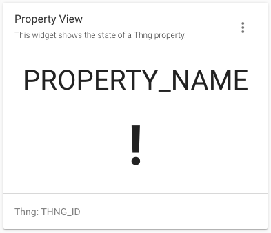
Finally, re-add the widget to any dashboard section and reload the Dashboard. The widget is present but must be correctly configured with a valid Thng ID and property name before it can be useful.
Use the Thngs section of the navigation to find or create a Thng with one or more properties, such as the one below.
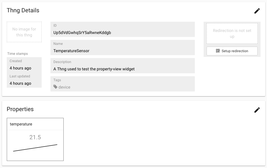
Make a note of the Thng’s ID and the name of one of its properties. Return to the widget and use the three-dot menu to configure it. Enter the Thng ID into the thngId field, and the property name into the propertyName field, and then save the widget configuration.
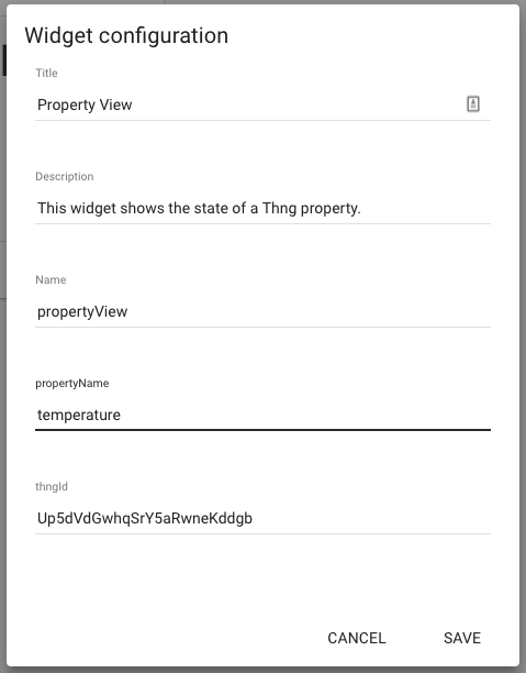
The property’s most recent value is now visible.
NoteThis simple example uses the unscoped view of the account to read the Thng. Ensure you don't have a project selected when testing it (select the None project).
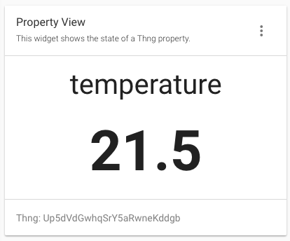
From now on, the value reflects the state of the Thng property when the page is loaded. The next exercise is to figure out how to make it update in real time.
Hint: it involves using the evrythng-mqtt.js SDK to add an MQTT subscription to the property.
Updated 11 months ago
