New Dashboard Look and Feel

The Overview page of the EVRYTHNG Dashboard has received an upgrade to enable more flexible use of the high-level summary widgets displaying the projects, products, actions, and Application Users in an account. This follows a large update last year that allowed developers to build their own widgets composed of Angular components, and set them up in new dashboard views. As ever, changes made to widget layouts are shared by all account Operators.
The focus this time around is on customizability and reusability. The new features include:
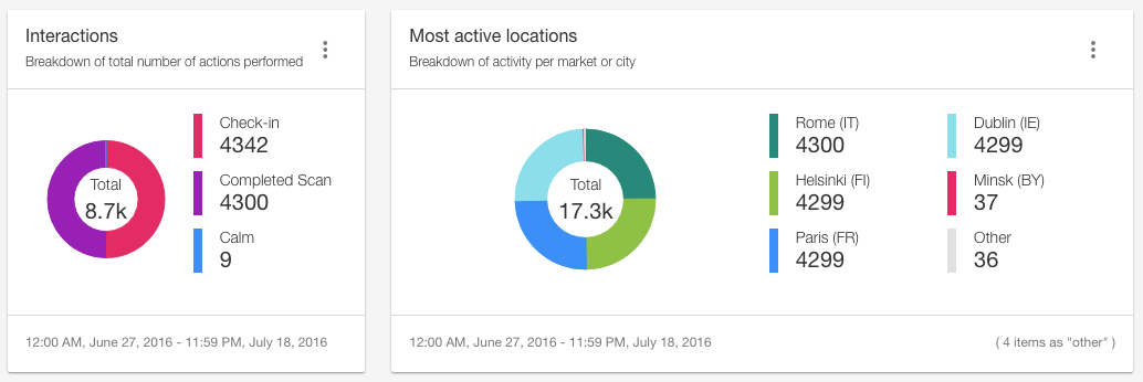
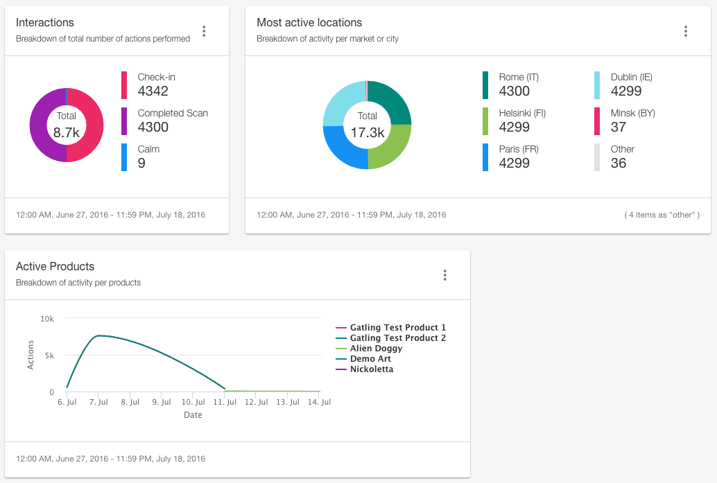
- A new visual look and feel, including a brand new color scheme and some new chart types.
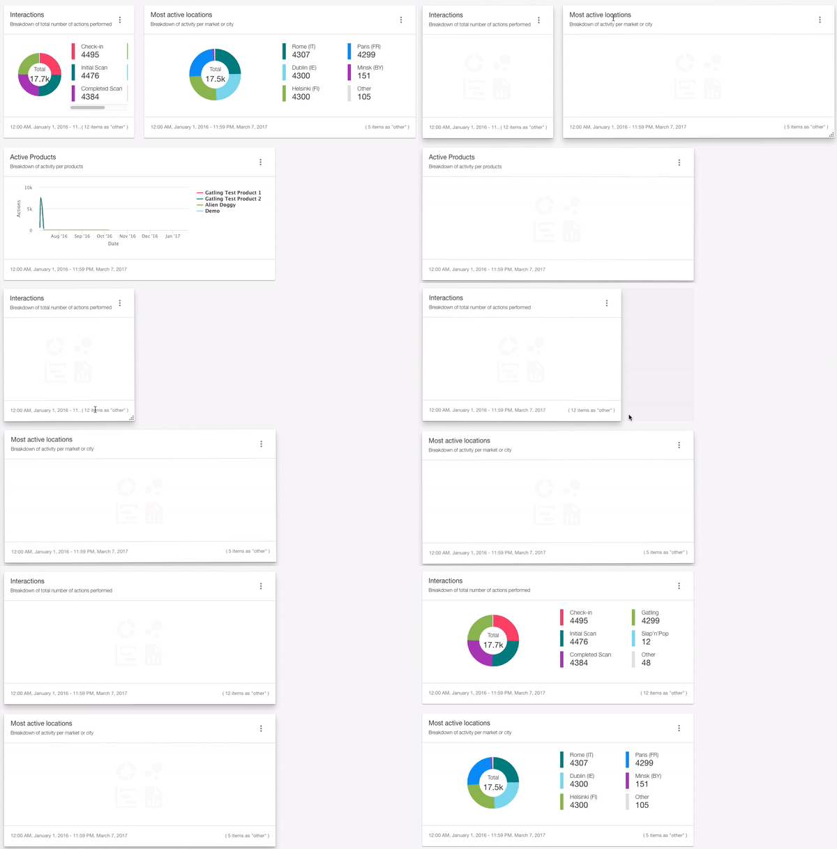
- The ability to reorder sections (groups of widgets) and move/resize individual widgets.
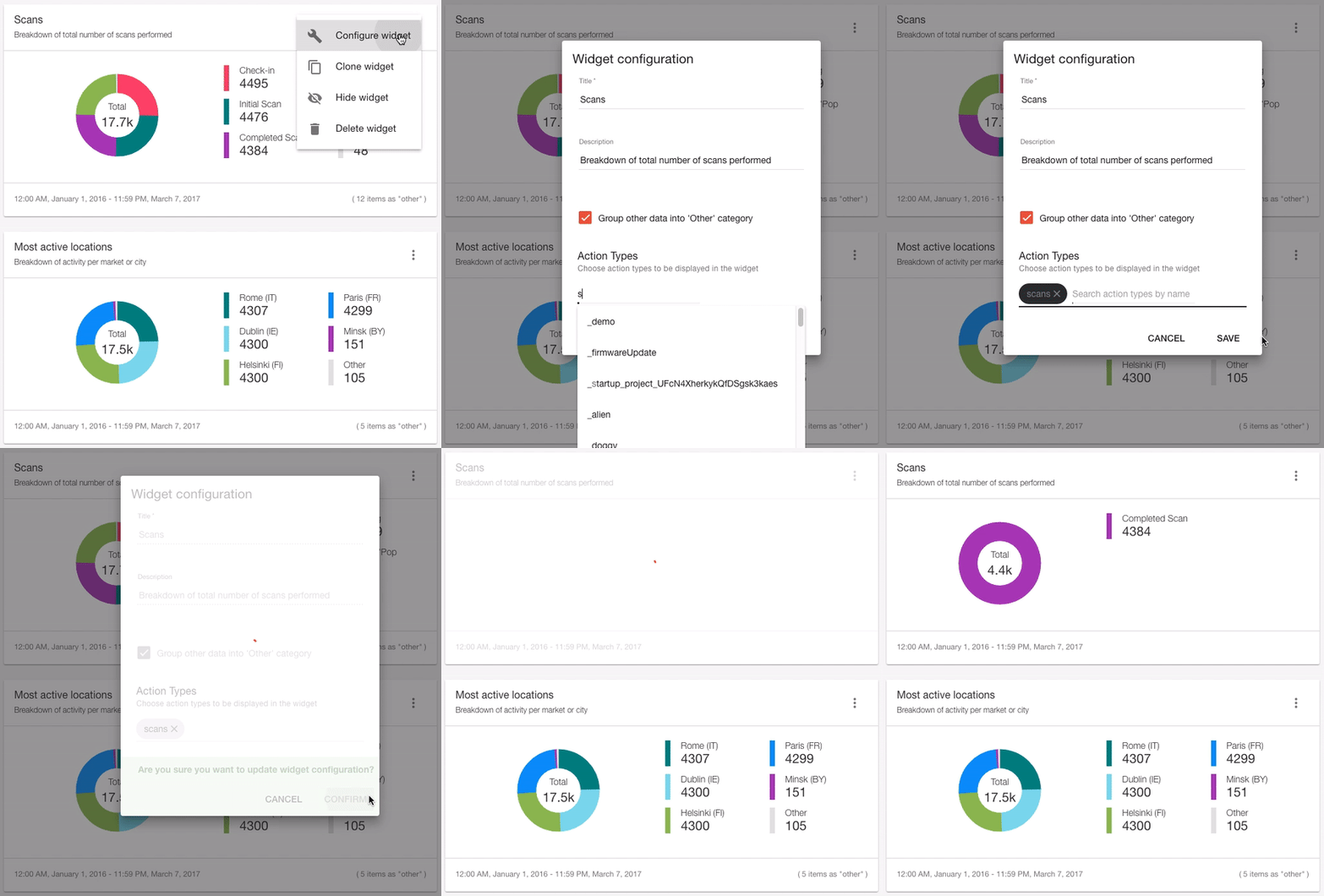
- Customizable titles and descriptions on all widgets.
- The ability to filter actions and products on those widget types.
- A clone ability to rapidly create copies of existing widgets.
Read on below for more detail on some of the more useful features you can now use.
## New Look and Feel
The new Overview widgets retain the functionality available before, but in a clearer and more visually appealing way. They can also scale to meet the one, two, or three column sizes available, and be reordered within their sections. Donut charts and new line charts provide a more immediate summary of the proportional data they represent.

Reorder and Resize
Each of the new widgets in the Overview can be moved and resized using the ‘Move and resize widgets’ button at the top of the screen. Use this to arrange the widgets to best suit your use case. For example, you may care most about the actions performed by your users, and so you can now move this widgets to the top and widen it to display more series at a time.

## Set Title, Description, and Filters
All of the new widgets support custom titles and descriptions, and some widgets (those concerned with actions and products) can also have filters applied to limit which of those types of resource are displayed. These features can be useful to provide context to the data displayed, particularly when actions and products are used to model more abstract concepts.

## Get Started
You can check out these new widgets right now in your Dashboard Overview, and begin moving, resizing, customising to suit how you personally use the Overview dashboard. For example, viewing only the most important actions generated by your smart alarm system, or the most popular products in your retail line.
To help you get started, read the Using the Dashboard Overview and Customizable Widgets pages for a quick overview of the features covered here, as well as learn how to create entirely new components from scratch.
We will also update the dashboard-components-starter repository on GitHub to serve as an up-to-date example of flexible custom Dashboard widgets.
